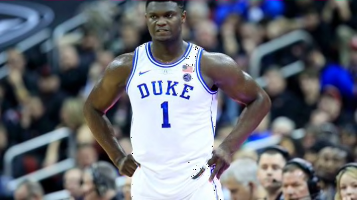
If the Duke and North Carolina didn’t have such classic uniforms these would be number one. They are one of the few teams that mixed things up and it works really well. They use a cool looking font, but they have their own spin to it that looks great. If you look at the design you know it is Florida State. The numbers are just a solid number but it has the outline and it looks good with the letters. They stay away from the collar and sleeve stripe but with the way the rest of the uniform is constructed it is not needed.
The shorts look good and it does have the famous Seminole logo at the bottom of the sides. It is back a little because of the stripe they have down the pants. But the stripe is not really a stripe and that is what makes this a great look. They use the feather design that the Seminole has in the logo. They use it down the jersey and to the shorts. This is the perfect example of using a design but it has a lot of meaning for the school. Others seem to just do a different design to try and look cool. Florida State uses part of its logo and is a great look. Each of their uniforms uses it and it is great.
Earlier (Boston College) I mentioned that I was not a big fan of maroon unless you do something special with the uniform. Well, Florida State does it with their uniforms and it makes it look great even though they are maroon. It isn’t a traditional looking uniform but it is a great look. They didn’t get too crazy with it but kept the roots of the school in the uniform. Too often schools miss the mark trying to do this. Again this is fantastic looking uniform and if Duke or North Carolina are ever misguided and switch their looks this would be the best.
