Busting Brackets
Fansided

SEC Basketball: Tennessee, Kentucky, and Georgia top uniforms in league

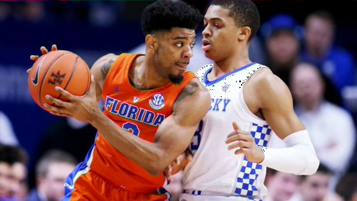
LEXINGTON, KENTUCKY - MARCH 09: Jalen Hudson #3 of the Florida Gators handles the ball while being guarded by Keldon Johnson #3 of the Kentucky Wildcats in the first half at Rupp Arena on March 09, 2019 in Lexington, Kentucky. (Photo by Dylan Buell/Getty Images)
LEXINGTON, KENTUCKY - MARCH 09: Jalen Hudson #3 of the Florida Gators handles the ball while being guarded by Keldon Johnson #3 of the Kentucky Wildcats in the first half at Rupp Arena on March 09, 2019 in Lexington, Kentucky. (Photo by Dylan Buell/Getty Images) /
facebooktwitterreddit
Prev
7 of 15
Next
GREENVILLE, SC – MARCH 17: Sindarius Thornwell #0 of the South Carolina Gamecocks reacts in the second half against the Marquette Golden Eagles during the first round of the 2017 NCAA Men’s Basketball Tournament at Bon Secours Wellness Arena on March 17, 2017 in Greenville, South Carolina. South Carolina Gamecocks won 93-73. (Photo by Kevin C. Cox/Getty Images)
GREENVILLE, SC – MARCH 17: Sindarius Thornwell #0 of the South Carolina Gamecocks reacts in the second half against the Marquette Golden Eagles during the first round of the 2017 NCAA Men’s Basketball Tournament at Bon Secours Wellness Arena on March 17, 2017 in Greenville, South Carolina. South Carolina Gamecocks won 93-73. (Photo by Kevin C. Cox/Getty Images) /

9. South Carolina Gamecocks

No lie, these unis are pretty fire, and they come in at number nine on our list. The SEC is full of nice basketball uniforms. Well, at least, for the remaining teams anyway.

On all of their uniforms, the outlining really makes the lettering and numbering pop. The striping isn’t too much, wrapping around the logo on the bottom of the shorts. The font on the uniforms isn’t the biggest, but it lines up with the shoulders on the uniform.

Usually, simple is boring. On these uniforms, simple is better. The contrasting colors on the base color of the uniform just meshes together and is easy on the eyes.

One gripe that was mentioned was the size of the font. Especially on the back of the uniform, there leaves a lot of empty space. The name is really small and it’s hard to see from a distance. Unless fans are good with numbers, they would like to know who these players are. The names should be just a touch bigger.

That’s a small thing, though, and the overall look is pretty sharp. The Gamecocks have a black alternate jersey. A home white, road cardinal/maroon color. Each uniform has the same design on it which is nice to see, for consistency.

6 out of 10. These aren’t bad uniforms at all, but the small lettering is really leaving something to be desired.