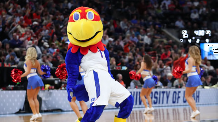
7. Kansas Jayhawks
This pains me to rank them this low because they normally have some of the best uniforms in the Big 12 and the country. But they just toyed with the uniform a little too much this year and it just is not a good look overall.
Before we get to the bad, though, let’s look at what’s good. The jerseys look very nice and clean. The font may be a little big on the letters, but overall it looks great. The blue numbers on the white jersey that are outlined in red look good. The blue jerseys also look just as nice but with white lettering. They keep it simple and it works. The outline of the collar and sleeves is always a plus in my book. It makes it look like a great basketball jersey and one many teams should pay attention to. They have done a stipe down the side in the past that has also looked good but is not needed. If only they could have done the same with the shorts.
What are they doing with the shorts? I am wondering if anyone knows. Why the stipe in the front? I don’t get that and it seems completely out of place. Yes, it does taper down to a stripe on the side but what is going on. It is not a good look. I am not sure why they think they need a stripe going down the front of the shorts, that almost never works. Keep the stripe on the side of the shorts or none at all.
They just need to go back to putting the iconic Jayhawk logo on the side of the shorts and be down with it. Outline the leg in a different color to make it pop and you have a great looking uniform. Kansas is one of those teams that doesn’t need to mix up their uniforms and I am not sure why they did it here. What it turned into was a bad looking set of shorts. Hopefully, they scrap this look for next year.
