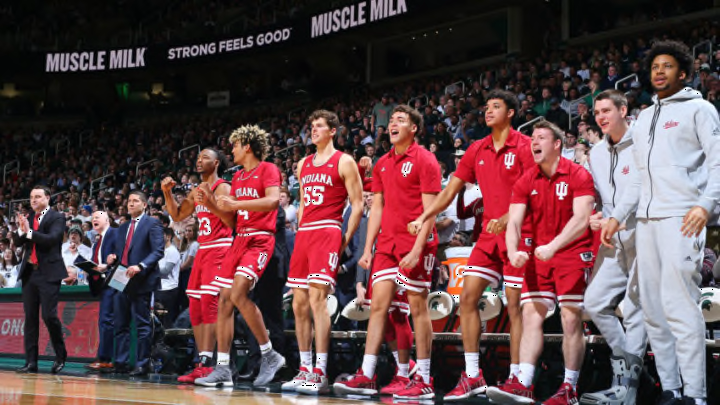
Big Ten Basketball: Indiana, Michigan, and Iowa top uniforms in league
By Adam Childs

At first look, the Nittany Lions do not look bad. They have a classic look that Penn State prides themselves on and the navy blue and white look is a good one. The font is simple but looks good and there isn’t a lot going on to clutter the uniform. But that is also the problem there is not a lot going on anywhere else on the uniform.
The only place they have anything else on their uniform is the stripe up the side of the shorts and jersey. The problem with that stripe is that it is only on one side. It just doesn’t make sense why they have a stripe on one side but not on the other. If they had it in on both sides it would look even and make the uniform look good all around.
That stripe would make a huge difference because of the lack of anything else. They don’t have the outline of the collar, or at the bottom of the shorts or anywhere else you normally see it on other uniforms. Nike went with a simplistic approach to their uniforms, but they left it too blank.
Penn State is proud of their simple and classic looks to their uniforms, but it just seems a bit dull for their basketball team. Combine that with the stripe on just one side and it makes for a so-so uniform and one for the bottom of the list in the Big Ten.