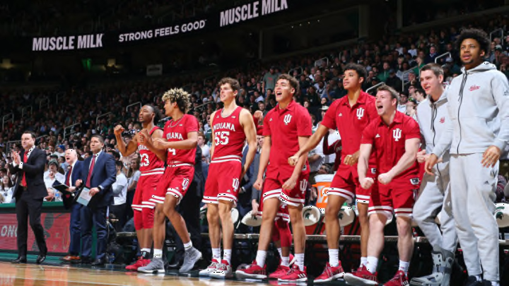
Big Ten Basketball: Indiana, Michigan, and Iowa top uniforms in league
By Adam Childs

Ohio State did a nice job of incorporating their stripe from their football helmets into their basketball uniforms. It looks nice but the stripe on the shoulder just looks like it was forced. The font on the jersey looks ok, but it makes it looked a little cramped. The numbers are simple and look good also.
While the stripe going down both sides of the shorts matches and for the most part looks good, it is weird how it does not flow all the way down. Right above the Ohio State logo on the side the stripe that comes from the bottom of the pants is not connected with the stripe running down. It overlaps it but it makes it look like a different stripe. I think it would look much better if it was all connected and looked like one stripe. It would also look better if the stripe ran up the side of the jersey. Take of the stripe on the shoulders and have it run up the jersey and this would be a good looking uniform set.
While they do not wear it much, the grey uniform is one of their better looks also. They are one of the few colleges that has grey as one of their main colors and it looks good when they use it in their basketball uniform. If they wore that more often instead of the white they would move up this list.