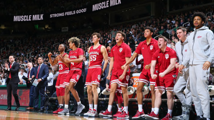
Big Ten Basketball: Indiana, Michigan, and Iowa top uniforms in league
By Adam Childs

Nebraska has a pretty plain uniform. The name across the chest in a pretty standard font for the letters and numbers. The numbers are outlined in black which makes it pop a little and is overall a good look. I even like the addition of the American flag on their jersey. It’s big enough to see but is not so big that it looks like it takes over the uniform or makes it too jumbled.
The problem is there is no other stripes or anything else like that on the uniform. It looks like they just found a plain uniform and put Nebraska on it. The other thing that just looks weird is the single letter N on their right legIt’sts not that the N looks bad, but way on the front of the shorts? It would be much better on the side of the shorts and then to have one on the other leg also. I am not quite sure why they did that, especially because when you are watching on tv you don’t get the full effect because you won’t see it much.
What I think would help make their uniforms better is if they wore their alternative one as their everyday uniform. The best one is the jersey that has Nebraska written in cursive. It is a good look and sets their uniform apart from the others. It also gives is that Nebraska signature to it and it looks really good on the red jersey. If they used that all the time they would be higher on this list.