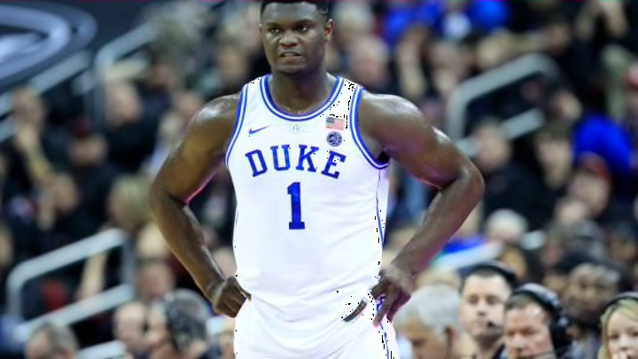
ACC Basketball: Duke, Wake, and North Carolina headline best uniforms
By Adam Childs

At first look, this is a good uniform. Orange and blue are a good color combination and the uniforms a good job of incorporating those colors. The collar is a solid color all the way around for a nice pop. The lettering and numbers look good and the contrasting colors of the two look good also. The double stripe on the shorts look good also, but I would like it to go up the jersey and complete the look. They also include the American Flag which is a good look.
So why then are they ranked down at 13? They have that random stripe on the shoulder. What is the point in that? Other schools have that stripe also and it looks equally bad. It is pointless and I do not know why the designed the uniforms there. It’s like some person just said we need another stripe, so lets put it on the shoulder. It is just a good look and with so many good uniforms in this conference it drops them down to the bottom of the list.
Virginia could have some of the best uniforms in the conference if they would get rid of that stripe and maybe add a stripe on the sleeve. They could also add in their V logo with the swords. That is a good logo and should be a good part of the uniform. But until then they will sit down at the bottom of the list.