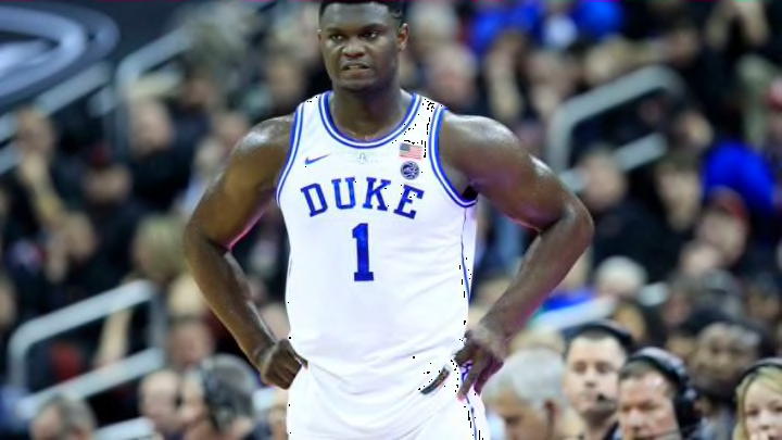
ACC Basketball: Duke, Wake, and North Carolina headline best uniforms
By Adam Childs

Let me first say that I actually think the orange and purple combination is not a bad look. It can pop and look really good on a uniform. Clemson usually looks really good on the football field because they use the colors well. The basketball team does a decent job also, but I feel like they could do a little bit better.
The design on the side of the shorts is not bad as they seem to try to mimic stripes on a tiger in some way. I again wish it would go up the jersey also to have that uniform look but it is not bad. It definitely looks better than the stripes Syracuse is trying to do. I also like how they use the tiger paw on the side of the shorts also. Clemson is known for that logo and it is good for them to include it. The different color waistline is a good pop of color also along with the color on the collar. All those are very good touches to a uniform.
Unfortunately, they have only part of a stripe around the sleeves. Why do some uniform designs decide to not finish the line? Just like a couple other uniforms, it makes it look incomplete and is not a good look. I also like the lettering and numbers, but personally, I feel like if they outlined them in purple it would really pop. The only white color just looks bland on a jersey full of color. They make a decent looking uniform but with a few tweaks like others, it could be even better.