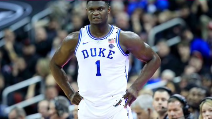
ACC Basketball: Duke, Wake, and North Carolina headline best uniforms
By Adam Childs

I am not a big fan of maroon uniforms but the Hokies do a decent job with theirs. The orange with maroon is an ok color combination if it used right and for the most part, Virginia Tech does that. There are things that a really good with this uniform which includes the color around the collar and the Virginia Tech being on top and bottom of the number. I think it would be too packed if it was all on top. They do a good job splitting it and like North Carolina later it is a good look.
I really like the stripe on the side of the shorts also, but like Syracuse and Virginia, I am not sure why they decided to put the logo at the top of the side of the shorts. It would look so much better at the bottom. I am not sure why they think this is a good look. It looks out of place up there and needs to be put on the bottom.
The other thing that just is a visual problem for me is that the number and letters are the same color but on the number is outlined. Yes the outline makes the number look pretty thick and doing the same with the letters would probably be too much, but I still think they could do something to make it more uniform. Either get rid of the outline for the number or make it a thinner outline and do it for the letters also. The font is different but really looks good on the jersey, they could just make it look better with the outline or at least making it look like the number.